Tuesday 30 April 2013

Taking PRide in CIPR's regional awards


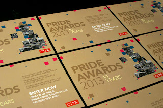
The Chartered Institute of Public Relations (CIPR) asked us to design an identity for its annual PRide Awards, which celebrate outstanding public relations across the 12 regions of the UK. The brief was to create an identity that would give the awards more prestige and gravitas to bring them more in line with the importance of the CIPR Excellence Awards, whilst highlighting the regional and inspirational aspect of them. The identity also needs to be flexible so that it can be used for subsequent years to build recognition.


Bearing that in mind, we created a marque made up of a stylised map of the UK, with black and white imagery from previous campaign entries to represent the 12 respective regions that are eligible for the awards. The rest of the UK map shape is made up of different sized pink and teal squares to add vibrancy and colour, whilst bold gold text on a muted gold background adds to the prestigious feel.


As 2013 is the 10th anniversary of the awards, we included a subtle light gold text reference to this without it being the focus of the identity, which means it can be easily removed for subsequent years.

Sarah Ion, Marketing Manager at the CIPR said:

“We’re delighted with the new brand look that to the point has created for the CIPR PRide Awards. We asked the team to develop a look that adds prestige but reflects the important values and qualities of our regional awards scheme. The new branding does this beautifully and we’ve already received great feedback from our regional and national group volunteers around the UK."

We’ve also designed an A5 call for entries postcard, web banners and graphics and are currently finalising an interactive e-brochure for entrants.

Showing off the PR Show


One of the best ways in which to make an impact when launching a new event is to make sure the identity is engaging and distinct, and support this with clear, concise messaging. The CIPR knew it would be in safe hands with us and are delighted with the results.

The Public Relations Show will bring together more than 1000 public relations professionals to network and discover the latest trends and tools in the industry. As it will be the first event of its kind in the UK, the CIPR really wanted to make an impact and generate awareness.

As such, we needed to come up with a vibrant, creative and engaging identity that was professional yet adaptable. As the focus of the show is very much on professional development, collaboration and learning, we based the logo around the idea that PR can guide and direct perceptions.

We created an iconic marque made up from different coloured interlinking directional boxes. When joined, they convey the message of synergy but they also have the flexibility to have elements used independently, on signage, wayfinding and sub-branding. They can also be used to help members and participants in the show find the information they need quickly.

The vibrant grey, dark turquoise, cyan and yellow colour palette offers visual intrigue and versatility for other marketing collateral, whilst the Avenir font plays a subtle nod to the current CIPR branding. We’ve created the master show logo and supporting logos that reference the different participants in the show - exhibitor, speaker, sponsor and visitor - for use across various show collateral.


We’ve created supporting digital collateral, including web banners and graphics to help launch the show, featuring the outline of old fashioned tickets and the blocks from the logo. Over the next few months we’ll be creating other print and digital marketing materials, so watch this space.


SeaBird R&A explores design shift


SeaBird Exploration, a global provider of marine seismic data for the oil and gas industry approached us to design its 2012 Annual Report. The brief to take the report to the next level was a welcome challenge. The client wanted a style and layout for the report that would provide a more contemporary look and feel, whilst ensuring it was professional, impactful, easy to navigate and a clear reflection of the SeaBird brand. We could also see there was scope to develop an enhanced visual language that could be applied across other materials. This would help to elevate the brand in tandem with improved market conditions and its positioning within the sector.


As a starting point, we wanted to create something that captured the essence of the brand. We adapted the seismic graphic device from the logo to capture this character on the front cover and then carried this device through the rest of the report to provide a consistent brand feel and visual interest. We created a main colour palette of grey and white, with bursts of yellow and blue providing more intense dashes of colour to draw the audience’s attention to the positive messages of growth and success, supported by key facts and figures. The use of grey and white allowed the mix of black and white and full colour photography to feel more unified and stand out against a neutral base.


We had a pretty tight timeframe for this so it was all hands on deck to turn it around, but with Sundays as working days in Dubai and the four hour time difference, we were able to meet every critical deadline.

See the full Report and Accounts as a PDF page turner here.

The personality of a brand


Last month was our turn to host the latest G7 event, a networking forum for the property, design and construction sectors. At each event, the hosts give a short presentation about an industry topic to encourage some lively debate, over a glass (or several) of wine.

We chose leading real estate company CBRE’s headquarters in Henrietta Street for the event. Not only is it a great entertaining space but it was also the perfect way for us to show off the interior environment work, including wayfinding, wall and window graphics and experiential digital graphics, we had created for its offices...which leads us nicely onto the topic of our presentation.

Taking a tongue-in-cheek look at brand personality - what it is, the importance of carrying it across all touchpoints, including the office environment and how we’ve done just that for clients - we challenged guests to a game of celebrity ‘Guess Who’. Based on a list of personality attributes, such as ‘impeccably dressed, stylish and proud to be British’ for one and ‘thought provoking, contemporary cool and quirky’ for another, we asked guests to guess the four personalities.

To show how we have bought personality to our clients’ environments/interiors, we then linked each personality and their attributes to one of our clients, with CBRE as James Bond going down very well with COO Martin Lewis.


We used Dawn French, whose attributes included ‘cheeky, light-hearted and energetic’ to represent Newsprinters, whilst Brian Cox was perfect to showcase the creativity we’d brought to The Francis Crick Institute, as he’s ‘approachable, young’ and ‘making science fun.’ Finally, Damien Hirst was ‘thought provoking, cool and quirky’ to reflect the work we did for Yahoo!’s Swiss headquarters.

Although intentionally light hearted, we did have a serious message behind our talk, in that design does have a major impact on people’s experience of an environment, the perception that it gives and the impression it can create.

See our presentation here and if you need any help expressing your brand personality or with your workplace environments, do let us know.