Monday 29 February 2016

Flipping February

Flipping for Silver


Like every year, pancake day crêped up on us (see what we did there). The atmosphere was tense as the tothepoint pancake racing team strode with purpose into the arena. Slicing through the crowds, like lemon through sugar, into the competitors enclosure, the smell of pancakes hung thick in the cool February air. There were thrills, spills and of course more than one pancake went astray.

The crack team of Will O’Byrne, Charlie Borley, Sarah Long and Lizzie Unwin stormed the heats and earned a spot in the final flip off. Sadly we were not able to secure gold and claim the prize, but with this being our 25th anniversary, our silver place was the right outcome.

Thanks to Better Bankside for putting on yet another splendid pancake race. We will be back next year for gold (or failing that another golden pancake)!


Apple FBI face-off


It’s been hard to avoid the news of Apple’s wrangle with the FBI this month, but it’s all ‘kicking off’ in the tech world over the other side of the pond.

To cut a long story short, the FBI in the U.S have found themselves in the possession of an iPhone used by the perpetrators of the San Bernardino shootings  in December. Naturally, they want to get access to the phone and it’s contents.

Simple right? Just ask Apple to unlock the thing? …not quite. Apple pride themselves on the security installed in their handsets. Ever since the introduction of the finger-print sensor, they’ve been adamant that not even they have access to a customer’s information. In an age of mass surveillance, where more and more people are permanently connected to the internet via a tiny computer in their pocket, the public would be worried if they thought all their private info was up for grabs.

Combine this with the information released by Edward Snowdon and Wikileaks founder Julian Assange over recent years, and the world is a much more paranoid place than it used to be and for good reason. Not worried? Check out this doomsaying article about the hazards of having a webcam and imagine what the [please insert your choice of government agency name here] would do if they could.

Back to Apple. They physically can’t unlock an iPhone. To do so would mean writing a bespoke version of the operating system and installing it on the handset, thus creating a ‘back-door’. To do that would set a dangerous precedent, and open a ‘pandora’s box’ that can’t be closed: open season for surveillance agencies could mean an end to the relative privacy that we enjoy today.

We’ve been interested in this area ever since we designed and built the website for the great guys at www.cybersecuritychallenge.org.uk. With their programme to identify, inspire and enable more citizens to become cyber security professionals, hopefully we’ll be a little more secure in the not too distant future.

To get more of the low-down, check out these articles:

BBC NEWS - Apple vs the FBI - a plain English guide

WIRED - Apple’s FBI battle is complicated 


QuantuMDX 


It’s good to see one of our clients getting the recognition that they deserve. This month QuantuMDX have received high praise for the strides they have made through their pioneering handheld DNA technology. This clever tech will help clinicians around the world to address global challenges by providing fast diagnosis of diseases, such as malaria, for just a few pounds. 

The appliance of bioscience and biotechnology are known as the “Fourth Industrial Revolution” due to the extraordinary impact they are having on global society and the economy, especially in the fields of medicine, agriculture and energy. Government Minister George Freeman made a visit to the Labs in the North East to show his support, which means there have been a few good shots of the logo we designed for them in the papers and on social media!

The art of contemplation


Tucked away amongst the rafts of books in the Foyles flagship store on Charing Cross Road is The Gallery. The space is currently curated and managed by Futurecity to help celebrate the work they’re doing in cultural placemaking (in other words, regenerating public areas across the UK). On first glance it might be overlooked by some, but the work of Peter Newman in particular caught the eye of our MD, who was instantly filled with romantic daydreams of enjoying the “Skystation” on a blue sky day in a quiet nook of London (chance would be a fine thing!).

“After days of looking at screens, surrounded by digital and physical chatter, it was very therapeutic to escape and enjoy a few minutes lying on the Skystation sculpture looking up at the fish eye skyscape image. Then taking a wander around this vast bookstore it almost felt that I was stepping back in time as I watched people, and some eccentric characters, browse the many beautiful books on display.”

Playing for the win…


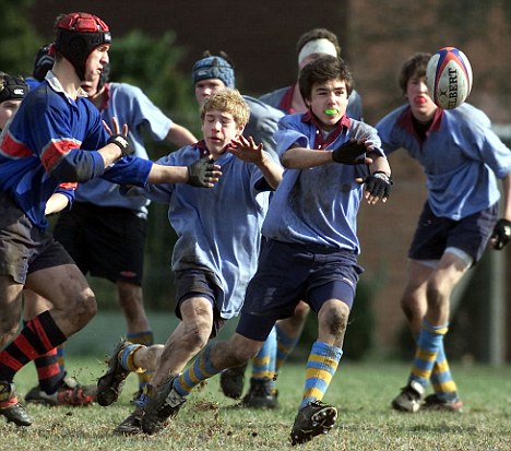
You may remember earlier this year we began working with concussion management specialists Return2Play. We are pleased to say that R2P have been confirmed as a finalist for “Best New Concept” at this year's Sports Technology Awards, a celebration of the most exciting and innovative organisations in global sport. The company, which launched just last year, are nominated alongside sports technology giants Hawk-Eye and BT, so they’re already keeping good company.

Return2Play have developed a system to help rugby clubs and players - from school teams to professionals - comply with new safety guidelines for the treatment of suspected concussion, monitoring players' recovery and helping them to return to play safely and efficiently.

"Being nominated in this category, alongside some heavyweight names in the field of technological innovation in sport, is real proof of the value of what we are doing. It's important that we all think about how to use technology, not just to change the way in which we play and watch sport, but also to ensure the health and safety of athletes at every level of the game." said Nick Somers, CEO and Co-founder of Return2Play.

After an initial strategic discussion over a pint of Doombar with our MD, R2P realised the importance of establishing a strong identity from the start to ensure they built recognition while promoting the service. We quickly got to grips with the business and brought their vision to life with a striking identity that works across all media, including icons for apps.

R2P have also been getting some national press coverage! Fingers crossed they win, but the nomination alone is a huge achievement!

Warning, contains nuts

Following on from the success of the KP Snacks interiors project we were asked to create websites for their three key brands – KP Nuts, McCoy’s and Hula Hoops. We were more than happy to oblige!


The sites needed to reflect the recognisable branding and individual brand personalities, as well as to showcase the KP Nuts and McCoy’s new pack designs.

As the three sites had similar requirements and content, we recommended a multi-site approach, where we build one main site and then duplicate the structure for the second and third sites but building in flexibility so that the styling can be adapted.


To tie in with the new packaging launch, the KP Nuts website has now gone live, pop over and take a look here.

The site primarily showcases their packs but also gives an insight into the KP Nuts brand story which started back in the 1850s. The site also highlights their work on sustainable farming across the globe and profiles them as the market leaders in nut snacking.


Keep your eyes peeled for McCoy’s and Hula Hoops that will follow in the coming months!

Croydon BID term time

Time flies when you’re having fun, and although the Croydon BID renewal ballot didn’t exactly sneak up on us, we still can’t believe the time has come to work with the BID team on the campaign to ensure they are voted in again for another term.

Of course there is a lot of talk about the great future in store for Croydon, with BoxPark coming later this year and plans for Westfield well under way. But it’s also the perfect moment for us to take stock and reflect on everything the BID has achieved (and some of the lovely design work that has accompanied this).

And to kick this off, with the help of Freshly Made Films, the BID have produced the perfect tool to showcase to the levy payers exactly what they’ve achieved during their 5 year term, and to highlight why they should continue the hard work in 2017 and beyond. The video (full screen link here) is also a great showcase for us, highlighting much of the work we’ve produced for them since winning the contract back in early 2013. This work started with evolving the brand and core messaging but since then we’ve produced a BID and community website, established the branding for the loyalty card scheme, produced the annual report, pledge banners and advertising as well as the brand and uniforms for the newly established Croydon ambassadors.


To kick-start the renewal campaign the BID has produced a questionnaire for levy payers and hosted three workshops, focusing on the regeneration of Croydon, safety in the area and looking at the 5 core pledges the BID made at the last ballot. With the help of Paul Clement of British BIDs, who ran the workshops, this research will feed in to the brief to ensure the correct messaging and emphasis on pledges meet the needs of business and the community during this time of great change.

We also attended these workshops to get a real insight into what is needed now and for the future. Our strapline ‘All change! Croydon’ has never had so much relevance as it does today but one initial observation was that for now, people need to know that ‘Croydon is still open for business!'. We’re looking forward to working closely with the BID like we did with our local BID, Better Bankside, when we helped them with their ballot in 2014 and they achieved another term.

Monday 1 February 2016

Simon says:

Be a Brand, not bland

Increasingly we are seeing the stripping away of complex graphics and a move towards simplicity. There are a multitude of brands who have removed style and substance from their logos to 'get back to basics' and minimalism - Google is a good example of this, gradually flattening the logo until a simple sans-serif logo remained.

Unfortunately many companies often see this 'simplification' at surface level, mistaking it for a cost effective way to evolve their brand. The result is they become more bland than Brand. What they are missing is the strategic approach these major players use to make their rebrand work, exploring their brand offering at the start and then using this to retain or enhance their brand personality and offer.

The mark of successful branding is a consistent visual and vocal tool kit that ensures that even if the logo isn't present, the style and tone of voice reflects the brand, however simple. Try it, cover up the logo on a brochure, website or even walk around a space - if the logo wasn't there would you know who the company was? If you wouldn't then their logo and brand aren't aligned.

Stand out for clout


As simplicity is implemented across all brand touchpoints there is a real danger of losing differentiation. This can certainly be seen with many of the open plan workspaces which are often described by staff and visitors as lacking personality. Some implementations of agile workspaces have introduced style, colour and designer furniture but these new spaces are all starting to look the same!

Even when stepping into the digital world we see different websites that have the same structure and user journey, and in some cases the same overused stock imagery! This lack of differentiation leads to a seriously underwhelming user experience. From generic layouts to generic words, it seems the craft of creative writing has been over looked. Never underestimate the difference good content and story telling can make in helping to communicate the offer and the authenticity of a brand.

With our work in print, digital and workplace environments, we are constantly looking for new ways of achieving differentiation for our clients. Our projects involving workplace environments have really helped us to explore opportunities. For Twitter, instead of huge digital screens in reception we opted for the more tactile 3D distressed wall of type featuring some of their more memorable hashtags and tweets. This makes up a 20 metre wall in their London office reception and it has become the ideal photo backdrop when their VITs visit (Very Important Tweeters). For Yahoo we created a series of art installations that reflected their new focus on content over technology, providing a visual representation of the yin yang of key subjects. For example for news 'war vs peace' there is the image of a dove of peace made up of toy soldiers painted in the Yahoo purple.

Truth will out

We work closely with clients at all stages of their evolution, getting to know them as well as looking to understand their audiences, both internal and external. One thing is clear though - it isn't just about talking the talk... the successful companies are those that deliver what they say they do. With the world watching, tangible proof or evidence of your achievements is essential, and no matter how powerful your brand, your messaging and your values, if what you deliver doesn't reflect what you say, the power of social media and a connected world will ensure everyone knows...

Our best work is with the companies and staff that believe in their values and what they are doing and share this with us - it inspires us and helps us deliver the craftsmanship to differentiate and elevate a brand. Some more examples of us bringing brands to life in workspace environments can be found in this pdf of a book we've just produced here. To find out more about how we bring brands to life across print, digital and workspace environments get in touch with us at tothepoint. +44 (0)20 7378 6999 or for more background visit our website www.tothepoint.co.uk/work.

New Year, New News


And The Winners Are….

It has been a source of distraction for many, but our 2016 calendar 'Silver Quiz' is now over and it’s time to reveal the winners. Thanks to everyone that entered, you all did a sterling job (OK, so maybe not all of you…) but there can only be five winners. Big congrats to 
Francesca Bozzard, Nick Somers, David Reid, Hayley Dove and Louise Errington. Your prize will be winging its way to you. Thanks for helping us start our 25th year with a bang.


Simon says: 

Be a Brand, not bland

The world of branding is forever changing, with trends and out-dated styles just like any other creative industry (and, indeed, the rest of the world!). However, it’s important to step back and make sure these trends are the right move for your business and its brand. Does the latest trend dilute your message, or maybe even give the wrong impression? In Simon’s article 'Be a Brand, not bland' he explores a few of the current trends and the impact these can have on a brand.

GSOH a must

This month we've been on the hunt for an eligible Senior/Mid Weight Account Manager to join the fold. It's a great opportunity for someone (even if we do say so ourselves), with some lovely clients and big projects on the horizon! If you know anyone with a passion for paper, a digital disposition and a cracking sense of humour then let us know. The full job ad is here.


Better backside


The NYE hangover has finally faded, the gluttony of Christmas seems a distant memory. Now as the new year stretches out in front of you, you may be forgiven for uttering that common phrase ‘this year will be different’. Don’t worry, we did the same and some of us have managed to live true to it thanks to our friends at Better Bankside, who put on a plethora of fitness extravaganzas that local businesses could take part in for free! This month Charlie, Katie and Lizzie have been hitting the mean streets of SE1 and joining in with Streetgym. Not as scary as it sounds, Streetgym is a workout class that uses the urban environment to put you through your paces. Sound fun? Check out the Streetgym website here.

For those of us that didn’t fancy the urban gym of the Southbank there was always our weekly Yoga session. Since the lovely Flo, of Flo Yoga, has been on maternity leave (pictured here with the lovely Nina) we’ve been downward dogging with Jasmine a.k.a Stretch And The City (we only work with pun loving teachers…).


360 videos


This month while browsing the deepest depths of social media we stumbled across this little gem. We find it amazing and inspiring to see creatives pushing the boundaries of what can be done with video. (If you can’t tell, we are really impressed with just how immersive these videos are on our smartphones.) It’s also worth watching how they do it! take a look on our Facebook page for both videos.


Pressing Issues

We’re always harping on about the value of the design process. Well this month we’ve taken it to another level, getting our hands mucky by learning how to use letterpress. A course at the New North Press, where we hand typeset a sentence, made us appreciate the speed and ease of our beloved macs while giving us a deeper knowledge and love of typography. A skill/process where making it ‘a little bigger’ is not a quick click away.


Valentines Quiz

And finally, with 14th Feb just round the corner you may fancy having a go at our Quote Bank Valentine Quiz from last year - it's still here for you to play. If we get time we may add some new quotes to freshen it up but for now the competition is back on and there's a bottle of bubbly up for grabs for the winner.


Patient Hub

Adaptive Apps approached us for help with their logo, branding and website for their new product, Patient Hub. Patient Hub is an app designed to allow healthcare professionals to work in a way that's familiar to them, whilst also bringing patient tracking systems used in primary care into the 21st century.


The brand needed careful positioning to appeal to both the healthcare professionals using the systems and the companies who will purchase it. It also needed to take into consideration ease of application of the identity across web, apps and print - so nothing too complex for a mobile screen. We chose to use blue and green, often seen in this sector, for the core brand colours, creating a fresh look whilst also giving the new brand a familiar medical feel.


The cross, made of arrows, also reflects the medical nature of the app but suggests the connectivity and interaction which is the core purpose and benefit. The cross and strapline: ‘connected care’ are used across digital and print with complementary information graphics.


The website’s primary purpose is to showcase the app and all its features. The challenge was to get across all of the functionality without overwhelming the reader. We worked closely with a copywriter to create the right tone of voice and clear messages. This is supported by visuals to showcase how Patient Hub is optimised for Windows, Android and iOS and is compatible with a broad range of devices.

The team at Adaptive Apps built a native app for each platform, allowing users to work on their preferred device, in a way that is familiar to them. The app also allows the user access to patient information with or without an internet connection.


The fully responsive website is based on Twitter's Bootstrap framework, built into a bespoke Wordpress theme. With simple icons and navigation at the top level there are links to more technical detail for those that really want to get to grips with the inner workings of the app.


It’s been a pleasure working with the team at Adaptive Apps. To have a look at the site click here.

Is your website flexible?

We recently undertook some jiggery pokery on a client’s ‘fixed size’ website to make it ‘responsive'. Nowadays, as you’re probably already aware, websites need to be ‘mobile friendly'. There are so many variants of screen size out there, not just mobiles, but tablets and all manner of laptops. The idea that a website can solely exist for traditional desktop screens is a thing of the past. 


Our client’s website wasn’t just fixed width, but fixed height as well. This raises another ‘issue' that some people still seem to cling on to, regarding the perceived ‘fold line’. As screens get bigger / taller / narrower / whatever, the idea that content can’t go below a certain measurement, or that users don’t like scrolling down pages, is a pretty old fashioned view.

But today’s browsing habits go way beyond how deep your browser is. With the number people browsing the internet on mobiles set to overtake people using desktops this year, Google actually marks your website down if your site doesn't respond. 


We have to ask ourselves; how does this affect browsing habits? With users often ‘on the go’ when browsing online, their attention span is even shorter than ever. They want to find what they're after, and fast.


So, is your website flexible and fast? 


Obviously, we can help with a ‘quick fix’ that helps your website behave on a mobile phone. But is that enough? Is the key messaging visible? Is the navigation system lucid? Can people see the BIG BUTTON and is it inviting?

For bigger websites, you can't simply stick ‘bandage’ on and crowbar it into a mobile view. You need to think of mobiles and desktop layouts together. The content can be the same, but the hierarchy should change to suit the device and create the best user journey. This takes a little more time of course, but with some intelligent design, it’s well worth the effort. And Google will love you for it!